The front cover of my digipak links with the magazine advert as it is the same image, same font, same positioning of the artist and song name; it's basically the same image on the digipak, adjusted to fit the magazine advert.
My ancillary texts also link to my video because it is clearly the same artist on the front cover as it is in the video, as well as the elements of mise-en-scene being repeated;
- The location of the narrative in the video is the same as the one on the ancillary texts (outside in the dark).
- The lighting is exactly the same thanks to the use of differing shutter speeds and a spotlight, which maintains the overall continuity.
- The costume is also the same in the narrative of the video as it is on the texts.
 These all mean that my ancillary texts follows the common conventions of music digipaks which I researched previously, some which are as follow:
- Main image is the artist
- The artist's name is included on the front image of the digipak
- The name of the digipak is also included
Then carrying on with the digipak and the music video, there are a lot of links, including the back of the digipak showing the girl facing away from the shot. This is similar to the tracking shot of her towards the end of the video and shows signs of continuity.
As well as this, the symbolic burning of the picture in the video is repeated on the digipak as the back of the CD cover is the picture on fire. This reminds the audience of what took place in the video and maintains the links within it.
 Effect on the audience
I posted my video and ancillary texts onto my Facebook page and asked the people on my friends list to watch and respond to a survey I created.
14 people had responded to my survey. Two questions in particular asked about my ancillary texts. Here are the questions and their responses.
The combination of my music video, digipak and magazine advert was effective on my audience, as shown in the questions above. When asked if the combination of the three were linked, all 14 of my respondents said "Yes". This means that what I was aiming to portray worked and my ancillary texts and music video were effective.
As well as this, when asked if my digipak and magazine advert were effective and representing and promoting the artist, one person in particular answered "You can clearly see who the artist is and what the album is," while another person said that the sense of continuity "attracted [him] to the album". Again, this means that my ancillary text was effective and worked very well to reach my target audience in a positive light.
Video Development
Analysing other music videos throughout my researching stages allowed me to see:
Video Development
Analysing other music videos throughout my researching stages allowed me to see:
- With almost every video, regardless of the pace, the pace picks up as it progresses.
- Most videos use low key lighting but has a spotlight on the artists' face, e.g. Miley Cyrus in The Climb.

- There's always more than one location
- If it's a performance video then it'll cut back and fourth to one main place where the song is being performed, e.g. I Want You To Want Me, Jason Derulo.

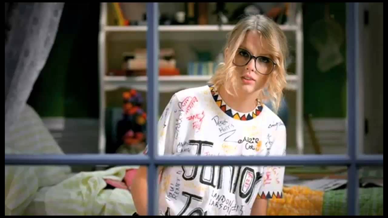
- If there's a narrative then it usually stars the artist as the lead, e.g. Taylor Swift in You Belong With Me.


These all helped me greatly with planning my video, letting me know what conventions I wanted to integrate into my video, e.g. point 4.
 Then, after analysing various digipaks as well, I knew to include links between the video and the ancillary texts. I knew to include an image of the artist to fit this genre of music, as a common convention of digipaks in the pop culture is to do so. As well as this, include the name of the artist and the song in clear writing in order to be eye-catching to my audience.

This helped me greatly to receive mainly positive feedback from my target audience as they all enjoyed the correlating digipak and advert to the video.
 Then, after analysing various digipaks as well, I knew to include links between the video and the ancillary texts. I knew to include an image of the artist to fit this genre of music, as a common convention of digipaks in the pop culture is to do so. As well as this, include the name of the artist and the song in clear writing in order to be eye-catching to my audience.
This helped me greatly to receive mainly positive feedback from my target audience as they all enjoyed the correlating digipak and advert to the video.


No comments:
Post a Comment