Tuesday, 15 December 2015
What have you learnt from your audience feedback?
What I learnt from my audience feedback during my research and planning.

 With the demographics of my target audience, I already knew that they were mainly Females ages 17 and this was followed up this time round with my research after the video, so nothing had changed there.
Finally, I learnt that emotion from the artist is key. This is because it allows the audience to see the real person under the mediated version of themselves and so they can relate to her vulnerability in this video. This makes them more appealing to a younger target audience and thus will attract a larger following and be successful.
On the whole, I was really pleased with my feedback. This is because my questions encouraged longer answers and so people wrote more about how they felt instead of having multiple choice answers.
As well as this, I really liked that my respondents were honest with their improvements and actually told me what I could have done differently instead of saying "nothing it's fine" as this gave me a real insight as to how they really felt about my video. It gave me a clearer picture about the whole of my coursework and where my time management slipped and so on.
During my research and planning, I set up and encouraged friends on Facebook to answer the questions so I could collect quantitative data that would help me to decide
- What genre of video to create
- How my target audience are
- How to get my music video to them
- What my target audience expect from a music video
And other vital pieces of information such as this. As a result of this data collection, I knew that my target market was predominantly females with a mean age of 17. They had a music video preference of a mixture of performance and narrative with a tied favourite genre of music of indie and pop. Then the question on location was interesting as initially, 65% of my answers said that the location wasn't important but then in my survey after I had shared my video, there were a few comments about needing more locations.
These allowed me to choose a song that would meet the needs of this target audience and begin to plan my video.
Further questions provoked answers that would influence my decision more, such as where my target audience watch music videos (online on YouTube) so I knew to post it here.
What I learnt from my audience feedback after posting my video online.
After I had posted my video onto YouTube and encouraged my target audience to answer my questions, I had gathered 14 lengthy responses from them which really helped me to gain an insight as to what my target audience thought of my video.
Although a few of my answers were quite brief, I learned a lot from them. I learned that my target audience really liked and valued the use of the piano in the song as it put an emphasis on the music. I really liked this response as to some people, music is everything and so seeing it visually can really influence their decision to purchase an album or invest in an artist.
As well as this, I learned that my target audience appreciated the simplicity of my ancillary texts. This is a convention I picked up from Ed Sheeran's ancillary texts for his latest album, where his advert was a simple picture of himself with minimal writing on it. I really liked this and so I incorporated it into my own magazine advert.

 With the demographics of my target audience, I already knew that they were mainly Females ages 17 and this was followed up this time round with my research after the video, so nothing had changed there.
Finally, I learnt that emotion from the artist is key. This is because it allows the audience to see the real person under the mediated version of themselves and so they can relate to her vulnerability in this video. This makes them more appealing to a younger target audience and thus will attract a larger following and be successful.
On the whole, I was really pleased with my feedback. This is because my questions encouraged longer answers and so people wrote more about how they felt instead of having multiple choice answers.
As well as this, I really liked that my respondents were honest with their improvements and actually told me what I could have done differently instead of saying "nothing it's fine" as this gave me a real insight as to how they really felt about my video. It gave me a clearer picture about the whole of my coursework and where my time management slipped and so on.
How effective is the combination of your main product and ancillary texts?
Synergy
The front cover of my digipak links with the magazine advert as it is the same image, same font, same positioning of the artist and song name; it's basically the same image on the digipak, adjusted to fit the magazine advert.
My ancillary texts also link to my video because it is clearly the same artist on the front cover as it is in the video, as well as the elements of mise-en-scene being repeated;
 These all mean that my ancillary texts follows the common conventions of music digipaks which I researched previously, some which are as follow:
 Effect on the audience
I posted my video and ancillary texts onto my Facebook page and asked the people on my friends list to watch and respond to a survey I created.
14 people had responded to my survey. Two questions in particular asked about my ancillary texts. Here are the questions and their responses.
The front cover of my digipak links with the magazine advert as it is the same image, same font, same positioning of the artist and song name; it's basically the same image on the digipak, adjusted to fit the magazine advert.
My ancillary texts also link to my video because it is clearly the same artist on the front cover as it is in the video, as well as the elements of mise-en-scene being repeated;
- The location of the narrative in the video is the same as the one on the ancillary texts (outside in the dark).
- The lighting is exactly the same thanks to the use of differing shutter speeds and a spotlight, which maintains the overall continuity.
- The costume is also the same in the narrative of the video as it is on the texts.
 These all mean that my ancillary texts follows the common conventions of music digipaks which I researched previously, some which are as follow:
- Main image is the artist
- The artist's name is included on the front image of the digipak
- The name of the digipak is also included
Then carrying on with the digipak and the music video, there are a lot of links, including the back of the digipak showing the girl facing away from the shot. This is similar to the tracking shot of her towards the end of the video and shows signs of continuity.
As well as this, the symbolic burning of the picture in the video is repeated on the digipak as the back of the CD cover is the picture on fire. This reminds the audience of what took place in the video and maintains the links within it.
 Effect on the audience
I posted my video and ancillary texts onto my Facebook page and asked the people on my friends list to watch and respond to a survey I created.
14 people had responded to my survey. Two questions in particular asked about my ancillary texts. Here are the questions and their responses.
The combination of my music video, digipak and magazine advert was effective on my audience, as shown in the questions above. When asked if the combination of the three were linked, all 14 of my respondents said "Yes". This means that what I was aiming to portray worked and my ancillary texts and music video were effective.
As well as this, when asked if my digipak and magazine advert were effective and representing and promoting the artist, one person in particular answered "You can clearly see who the artist is and what the album is," while another person said that the sense of continuity "attracted [him] to the album". Again, this means that my ancillary text was effective and worked very well to reach my target audience in a positive light.
Video Development
Analysing other music videos throughout my researching stages allowed me to see:
Video Development
Analysing other music videos throughout my researching stages allowed me to see:
- With almost every video, regardless of the pace, the pace picks up as it progresses.
- Most videos use low key lighting but has a spotlight on the artists' face, e.g. Miley Cyrus in The Climb.

- There's always more than one location
- If it's a performance video then it'll cut back and fourth to one main place where the song is being performed, e.g. I Want You To Want Me, Jason Derulo.

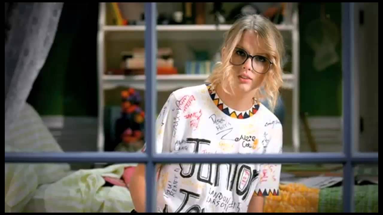
- If there's a narrative then it usually stars the artist as the lead, e.g. Taylor Swift in You Belong With Me.


These all helped me greatly with planning my video, letting me know what conventions I wanted to integrate into my video, e.g. point 4.
 Then, after analysing various digipaks as well, I knew to include links between the video and the ancillary texts. I knew to include an image of the artist to fit this genre of music, as a common convention of digipaks in the pop culture is to do so. As well as this, include the name of the artist and the song in clear writing in order to be eye-catching to my audience.

This helped me greatly to receive mainly positive feedback from my target audience as they all enjoyed the correlating digipak and advert to the video.
 Then, after analysing various digipaks as well, I knew to include links between the video and the ancillary texts. I knew to include an image of the artist to fit this genre of music, as a common convention of digipaks in the pop culture is to do so. As well as this, include the name of the artist and the song in clear writing in order to be eye-catching to my audience.
This helped me greatly to receive mainly positive feedback from my target audience as they all enjoyed the correlating digipak and advert to the video.
Monday, 14 December 2015
Saturday, 5 December 2015
Wednesday, 18 November 2015
Wednesday, 11 November 2015
Digipak Name
In the midst of designing my digipak for my artist, I came up with an idea to rename it "Burning Nature" instead of "Trouble" (the name of the song). I made a rough copy of what it would look and sound like and when I asked my target audience what they thought of the name, 60% of them preferred the name of the digipak to be "Trouble" since it's the name of the song and fits better with the artist name.
Therefore I will be calling the digipak "Trouble," since it is what my target audience prefer and since it is more fitting to my theme.
Therefore I will be calling the digipak "Trouble," since it is what my target audience prefer and since it is more fitting to my theme.
**Costume and Props Plan
I decided on the costume of simple black jeans and a white top for
the piano scene as it’s simple but effective. It tones down the whole video
from a slightly unrealistic representation of who the singer is to the girl
whose heart has been broken. This again makes her more relatable as an artist
to her audience.
As well as this, the chosen colours could be a metaphor for
her good and bad sides, the good with her on the piano and the bad with her
vengefully burning the photograph.
For the other scenes for the narrative, I've decided on another
natural look of a black top with denim jeans. I want this costume for similar
reasons as the decision for the first costume; it makes her seem more real. Instead
of the viewer’s seeing her as a superstar, they see her as a real person and
can find her and her music more relatable.
Props
The main props used in this video will be:
1. Piano
2. Photograph
3. Lighter
The minimal use of props puts more of an emphasis on her and her
music again. Instead of the song being about things, it’s about emotion and
feelings. This is shown through the piano, normally quite an emotional
instrument used to portray deep feelings, and the lighter which symbolises the
end of their love.
Digipak/Video Inspiration
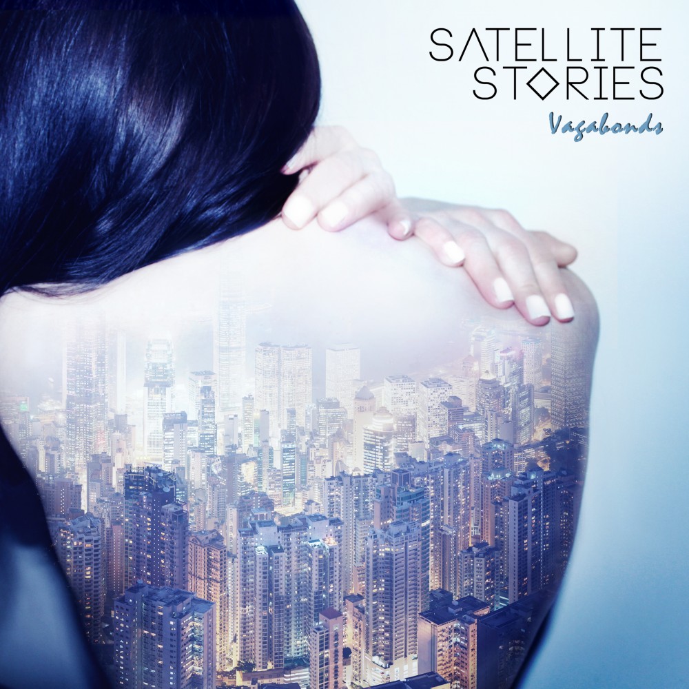
I was looking at digipaks and found this one which is for the band "Satellite Stories" for their song "Vagabond". I really like the use of a female on the cover with a shadow of a city on her back.

I could use this idea for my own digipak or music video and instead of using an unknown actor, use the artist and have her face the camera instead with the faded image of a burning picture layered on top.

I could use this idea for my own digipak or music video and instead of using an unknown actor, use the artist and have her face the camera instead with the faded image of a burning picture layered on top.
Tuesday, 10 November 2015
Saturday, 7 November 2015
Record Label
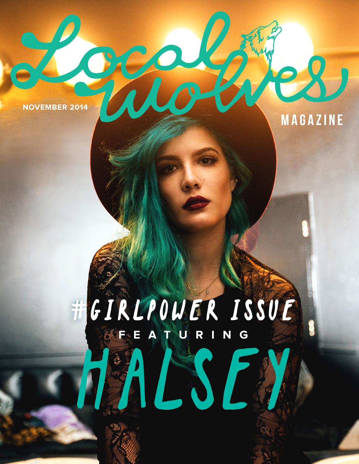
I have decided that the record label my artist Jules is signed to will be Capitol Records. This is because it is a broad music record, signing a wide variety of artists from Halsey to Bastille to Coldplay. This allows for my artist to be more flexible with her music and style.
As well as this, Capitol Records are known for allowing their artists to start up their own record labels with Capitol. This is beneficial to my artist as she would be free to start her own music and have control over her career.
Friday, 6 November 2015
Aritst
I have decided to use my original artist for this idea, so I'll be reverting back to the name "Jules" for this video. However I want to change the font and style of the digipak/magazine advert so I'll develop it so it matches the new song.
Here's a brief recap of Jules.
Jules
My solo artist is going to be an English 20-something female who found fame on YouTube and Sound Cloud when she posted covers and original material onto both accounts. Then, she was founded and quickly signed to Capitol Records where she is to complete an album, 5 singles and a tour.
Comparable artists:
After doing some research, I've concluded that the following artists are comparable to mine
- The 1975
- Verite
- Twentyone Pilots
- Banks
- Melanie Martinez
Magazine's you'd find Jules in:
Q, Elle, Local Wolves, NME; a mixture of fashion and music.
Typical video from Jules:
Jules is likely to create a performance video with a mixture of narrative and concept elements due to her creativity. Music is her outlet and so the video is a platform in which she's able to portray her lyrics and music visually, and so it's likely to be be a bit of everything.
Subscribe to:
Comments (Atom)


